autowrap graphics
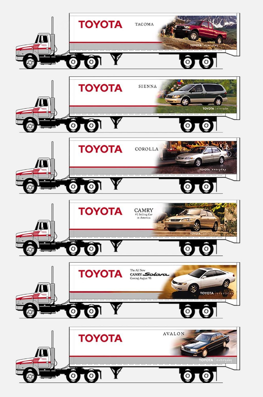
Soon after auto wrap graphics became available, Toyota Motor Sales, U.S.A. realized their 50’ trailers were like coast-to-coast, mobile billboards and asked for artwork to promote key products in the North American market.
Marketing decided which vehicles to display and supplied us with photos but there was a problem: The executives insisted the car images face the same direction as traffic. This
direct mail
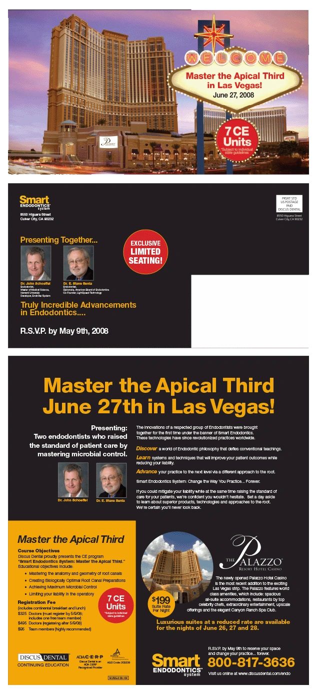
Due to the advent of digital marketing and the high cost of postage rates, direct mail has greatly diminished. But for the last few decades, it was an advertising vehicle many companies relied upon to gain new customers and retain their existing customers.
Discus Dental had successfully conditioned its customers to respond to direct mail. Whether it was a new product, reorder reminder or announcing new product features and benefits, direct mail was usually the weapon of choice. As you can imagine, we produced a great deal of it every week
event invitations
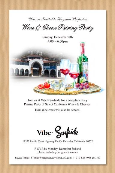
This low-volume invitation was printed on a heavy laserwriter stock, then hand-glued to a tan colored, recycled, corrugate board.
The goal was to invite the residential neighbors to the opening of a newly renovated property on Pacific Coast Highway in the Pacific Palisades, California. Note that this was during Hayman Properties’ transformation into the Vibe brand.
When time and budget allow, I enjoy working on invitations, whether they’re short- or long-run. It sometimes offers the opportunity to express more than the usual amount of personality.
logos

I love designing logos because they represent the company, product, or individual. Typically, they must be reproduced against any possible type of background and still work. But perhaps the most elusive of all requirements is to design a mark that hints at the function or value of the product or company, as well as creates the beginning of an ambiance: A style, a look and feel.
If you’re curious wh
offering memorandum

Offering memorandums contain a great deal of the information a potential investor or property owner would need to consider. They vary from a short-form of just several pages to as much as 48.
These were often created for Robert Hayman’s real estate companies when they were either seeking investors or selling a property.
packaging
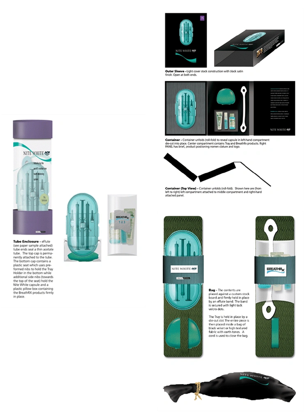
The majority of my packaging experience is from producing medical and dental devices and products. Soft-touch finishes, clamshells, custom die-cut boxes, magnetic enclosures, etc. etc.
But rather than show you those, here are three concepts that were submitted during the Discus Dental NiteWhite / DayWhite rebranding. The assignment was to develop concepts for a ‘blue sky’, spa-like solution.
presentations
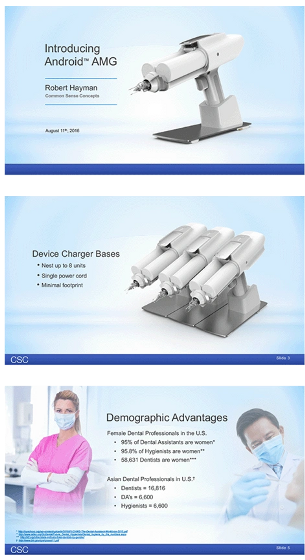
The Android AMG device was developed by the client and pitched to several manufacturing and distribution companies but unfortunately, an agreeable arrangement could not be met.
The presentations were created in PowerPoint and mixed both product images and dental practitioner imagery. Shown here are several extracted pages.

Presentations can take the form of a business pitch, a board of directors meeting PowerPoint or Keynote, or simply an informational video that runs on a loop.
Shown here are the PowerPoint cover slide to a Perimetrics, LLC business plan presentation and an older version of the printed deck.
As
publications

Any type of publication can be challenging, if for no other reason because you’re working with client content, executive approval and a firm deadline.
Working at publications and ad agencies taught me to develop presentation concepts as close to final art as possible. Working live, in this manner, shortened turn-around times once the client made a selection.
stuff

Invariably, a client will request a project that is outside my scope of experience, expertise and education. But just because it’s not in my skillset, doesn’t mean they let me say no.
Shown on this page are...
1932 Ford Coupe roadster with a Lexus V-8 engine. I designed the gauges, candy apple red lacquer and the engine cover. It was used by Lexus at the LA Auto Show.
First Coastal Bank annual report.
Toyota corporate jet touch screen controls for cabin crew and passengers.
Lexus holiday card with white ink printed on vellum to simulate a frosted window. Opening it revealed the Lexus in a Photoshop created snow environment.
Two paintings of Japanese warriors - it's an old hobby of mine. One that I wish I had more time for but don't.
A SketchUp model for interior design.
I honestly never know what a client is going to ask me to do next. But it keeps it interesting.
style guides

To enable their many offices and locations could ensure consistency, Ryland Homes requested two manuals that would specify every marketing and sales collatoral piece. Collectively, both manuals combined for over 100 pages. Print on demand was also engineered for their company wide use.

Style guides were developed for Zuma Dental’s Z-image digitial imaging software and its Z-ray digital intraoral sensors.
This start-up was also my first client-side experience with SaS (software as a subscription). It was interesting to see how the new approach had a ripple affect of change on almost every aspect of the project.
trade shows

Trade shows are always more involved than you might expect. Booth designs, hand outs, invitations, email reminders, web page announcements, social media buzz, show specials, table top marketing pieces, table tents, flatscreen videos, extending banners, table cloths, shirts, branded everything and staff training.
Today, it’s still an excellent choice when launching a new product. The insights gain
websites

The Vibe Boutique Offices websites continue to evolve to reflect the Vibe business plan.
The corporate website was designed for investors, potential investors and leasing brokers while the microsites (one per commercial office building) were built from a template and targeted towards tenants. In line with the Vibe concept, each site will continue to evolve to reflect its unique location, demo and psychographics.
Robert Hayman personally crafts each property until it functions well, offers tenant amenities of value and tries to transform them into a place you’d like to go to work.

I’ve worked on many websites but this was by far the most complex.
Although Zuma Dental ceased operations due to product related issues, a full Magento eCommerce website was ready to launch.
Two interesting challenges arose during this project. First, we experimented using a programming team in Inda and second, 5 weeks prior to launch, the CEO asked me to make the entire website black.
Shown here are a black product page, and other secondary pages. The system generated email is also an example of my instructions for programmers.